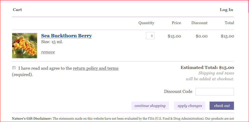
On our OLD website, once you added something to the shopping cart and clicked on the "Continue Shopping" button, it took you back to the main page of the website. Very unintuitive and inconvenient.
On the NEW site, if I am shopping for Spikenard, for example, and bring it up either from the drop down aromatherapy products menu or from the search box, I am here:
Clicking Add to Cart obviously enough puts that item in the selected size into the shopping cart:
NOW... because I am not finished shopping, I click "continue shopping"...
As currently designed, the continue shopping button takes you back to the product you just ordered, in this case, to Spikenard. And you can view the "cookie crumb" trail above to go to the alphabetical section you were on (S-T), to the whole Essential Oils Category, to the overall Products section if you want to buy some bottles, or a carrier oil, or back to the main HOME page to explore other options.

Some users have complained that going back and forth requires too many mouse clicks. We are wondering if you would prefer to have the "Continue Shopping" button take you to the alphabetical section the last item was found in??? (in this case, S-T, for the Spikenard.)
Would that be more efficient, more intuitive, or would it be confusing?
If you came here because of our query on our Facebook page you may reply there, or here, but please let us know whether you would prefer to have "continue shopping" take you back to the last PRODUCT or to the last "SubCategory"
Thank you for your input~


9 comments:
I prefer when I add something to my cart for it to show it popping in there, and leaving me on the page i'm on. Then if I want to review my cart i can just click on the cart icon to take me there.
I prefer to go back to the product I was on. I can backtrack from there.
I know this comment is late and I'm not sure if you have made a change yet but I think a continue shopping button would be nice.
I like the drop down bar idea better. That way you aren't flipping back and forth between screens.
Zach, there IS a 'continue shopping' button. The debate is where that button will take you to.
This is the first time on your site. it appears a comment is required before i can look at your products. I have no opinion as to wheather this is an improvement or not
Anonymous your comment totally confuses me. This isn't the website, this is our BLOG. If you want to view products I would suggest that you go to www.naturesgift.com There are no products to be seen here. Had you not left the comment anonymously I would have been able to contact you and perhaps clarify what the problem or misunderstanding is.
I think landing on the essential oils page with the alphabetic options at the top would make the most sense. I don't think it matters if it starts at A or if it matches the oil you just added to the cart. Either way, I think that would be the most helpful.
I agree with the alphabet..what are the odds I want the next item listed after Spike?
Post a Comment